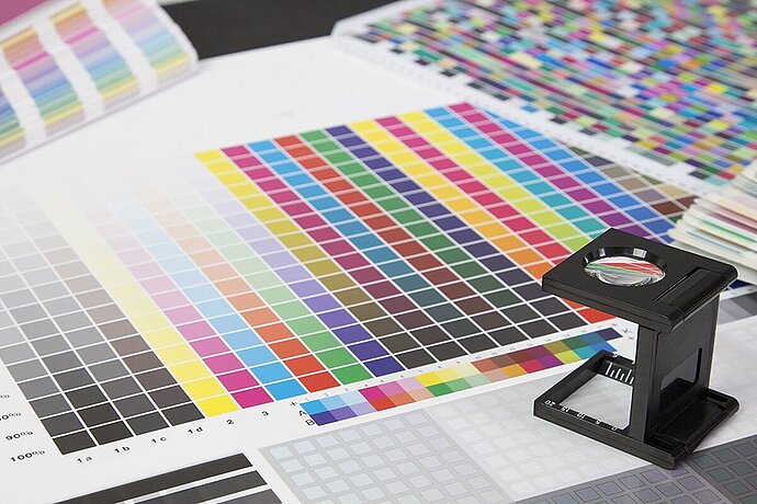
The reasons for colour management were mentioned in the last part of the series. If the printer can print colours that are not included in the gamut of the photo, then the result is clear: These colours will not appear in the print. If you do not know that your pizza delivery service also delivers ice cream, you will not order it and so not receive it. If, on the other hand, the gamut and the image contain colours that the printer cannot print, other colours will be printed instead. But which ones?
Episode 07
How are colours converted?
Colour management for photographers
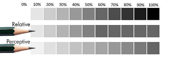
To show what happens with colours that the printer cannot print, I will come back to my pencil gamut from the article about gamuts. The pencil was able to reach a maximum of 60% of the blackening of my laser printer. It was not possible to achieve any greater blackening than this with the simple pencil. To illustrate, I will show here what happens when I convert an image from the gamut of the laser printer to the gamut of the pencil, that is, if I try to reproduce a laser printer image with the pencil presented in episode 1.
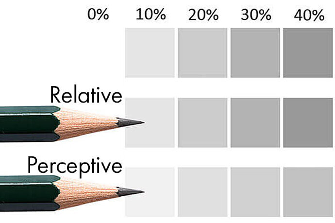
There are two common techniques for converting colours: relative (sometimes also referred to as relative colorimetric) or perceptual. In the following, I show the grey levels from 0% to 100% from my laser printer and below each the converted version of the colour that takes into account the maximum grey level of 60% of my pencil.
Difference between relative and perceptual conversion
In relative conversion, all grey levels up to and including 60% remain exactly as they are in the original. Everything that is darker than 60% is simply changed to the maximum 60% brightness. Relative conversion is the standard case.
In perceptual conversion, on the other hand, the gradations are redistributed, making all colours brighter, so that a difference remains visible even in the dark areas. Perceptual conversion does not work with all profiles.
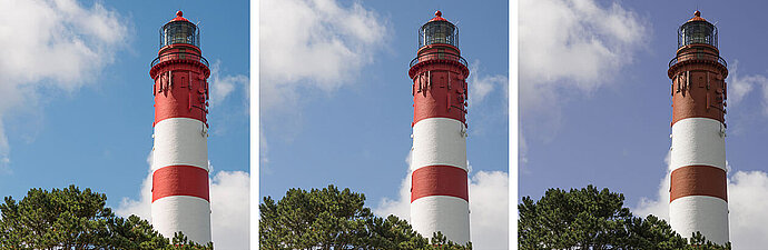
The relative technique tries to maintain the intensity, while the perceptual technique tries to preserve the details. Depending on the image, sometimes one method is better and sometimes the other method is better. If the image contains only a few colours to be adjusted (that is, in my pencil case, it tends to be bright), then relative is better suited to preserve the overall impression, whereas perceptual makes the picture look dull by comparison. In the following, you will see the same image three times. The original, which contains few of the cut-off colours over 60%, is on the left. In the image in the middle, the relative technique has been used to convert to the pencil gamut. In the image on the right, the perceptual technique has been used.
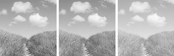
Left: few invalid colours | centre: converted using relative | right: converted using perceptual
In the bright dune photo shown, relative provides the better result. Although details are lost in the grass there too, this is so slight that it does not disturb.
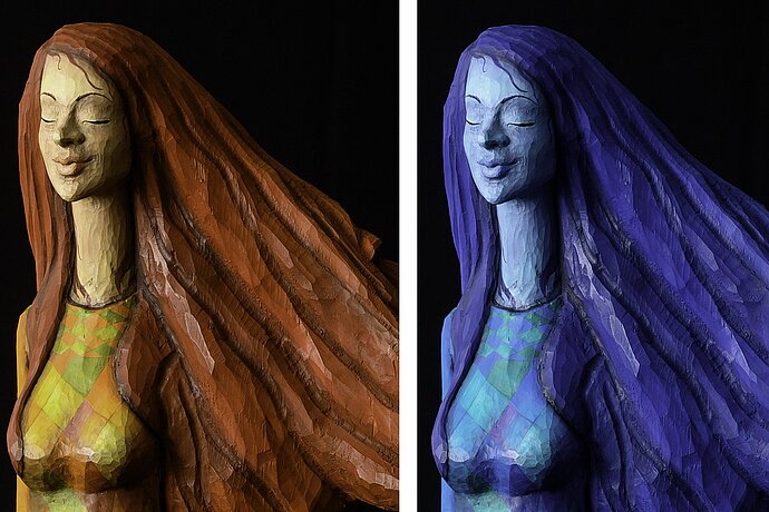
If, on the other hand, I take an image that contains many of these colours to be converted and there are also gradations in these colours, then the details in these colours may get lost if relative is used. In the following example image, the dark building becomes almost invisible when the relative technique is applied. When perceptual conversion is used, the image appears dull, but the details are still visible.
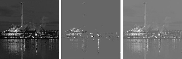
Left: many invalid colours | centre: converted using relative | right: converted using perceptual
If, like me, you work with printing companies, you usually have no choice anyway. Printing companies usually use relative conversion, and that’s that. Here, you should check the colours beforehand in soft proofing and adjust them so that the details are retained.
Other conversion methods
Photoshop features other methods for converting colours from one gamut to another: absolute colorimetric and saturation. Both methods are unimportant for photographers.
Absolute colorimetric is used to print a proof at the pre-press stage, that is, to produce a test print on a digital printer before printing the material in the offset process.
Saturation simply attempts to achieve the most vibrant colours, with no attention to detail. This is useful for business graphics, but not for photos.
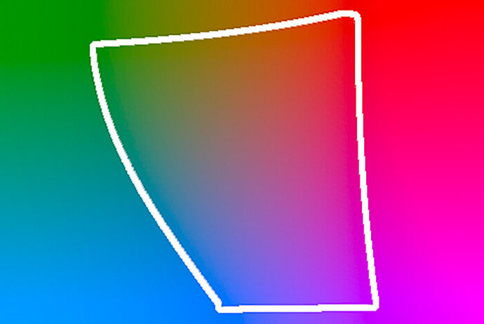
Assigning profiles
In addition to the methods of converting an image’s profile into another profile, image processing programs such as Photoshop also offer the option of assigning another profile to an image. You can compare this with currencies: If I convert US$10 into euros, that makes about €7, depending on the exchange rate. If, on the other hand, I simply assign the euro to the US$10 as a currency, that would result in €10, which is definitely wrong. The situation is similar with colour profiles. To achieve the correct result, I have to convert from one gamut to another. If I simply assign the gamut, the result will be wrong (except, of course, if I am correcting an incorrect assignment). One use case for such an assignment is for screenshots from a calibrated monitor. You have to assign the screen profile as a gamut to the screenshots and then convert them to the working colour space to get the right result.
Here, once again, are some images from previous articles that have been assigned an incorrect gamut and therefore show the wrong colours.
Left: Adobe RGB correctly interpreted | centre: Adobe RGB not considered | right: ProPhoto RBG not considered
This happens when you assign a gamut to an image instead of converting it to one. The following articles show how to create profiles for different devices.